Company Rebrand
Centro to Basis Technologies
ROLE: Creative Director
As Creative Director, I led the transformation of Centro into Basis Technologies, capitalizing on the existing product name, Basis, to align with enterprise-level aspirations and elevate the tech's market perception.
Business Impact
This strategic rebrand was designed to set the stage for an IPO, and though the company chose a different path, the rebrand significantly strengthened our foundation for future growth. The rebrand resulted in a 28% increase in daily website users and a 15% rise in post-launch traffic compared to the peak pre-launch day, markedly enhancing our market presence.
Vision
Transitioning from the vibrant Centro brand, Basis Technologies adopted a sophisticated black-on-black color palette. The new visual identity introduced a hexagon motif, signifying a shift towards a more design-forward aesthetic. On launch day, we unveiled a new website featuring 18 revamped pages, streamlined navigation, and enriched content, supported by partnerships for custom photography and multimedia campaigns.
Creative Direction + Process
New Brand Identity
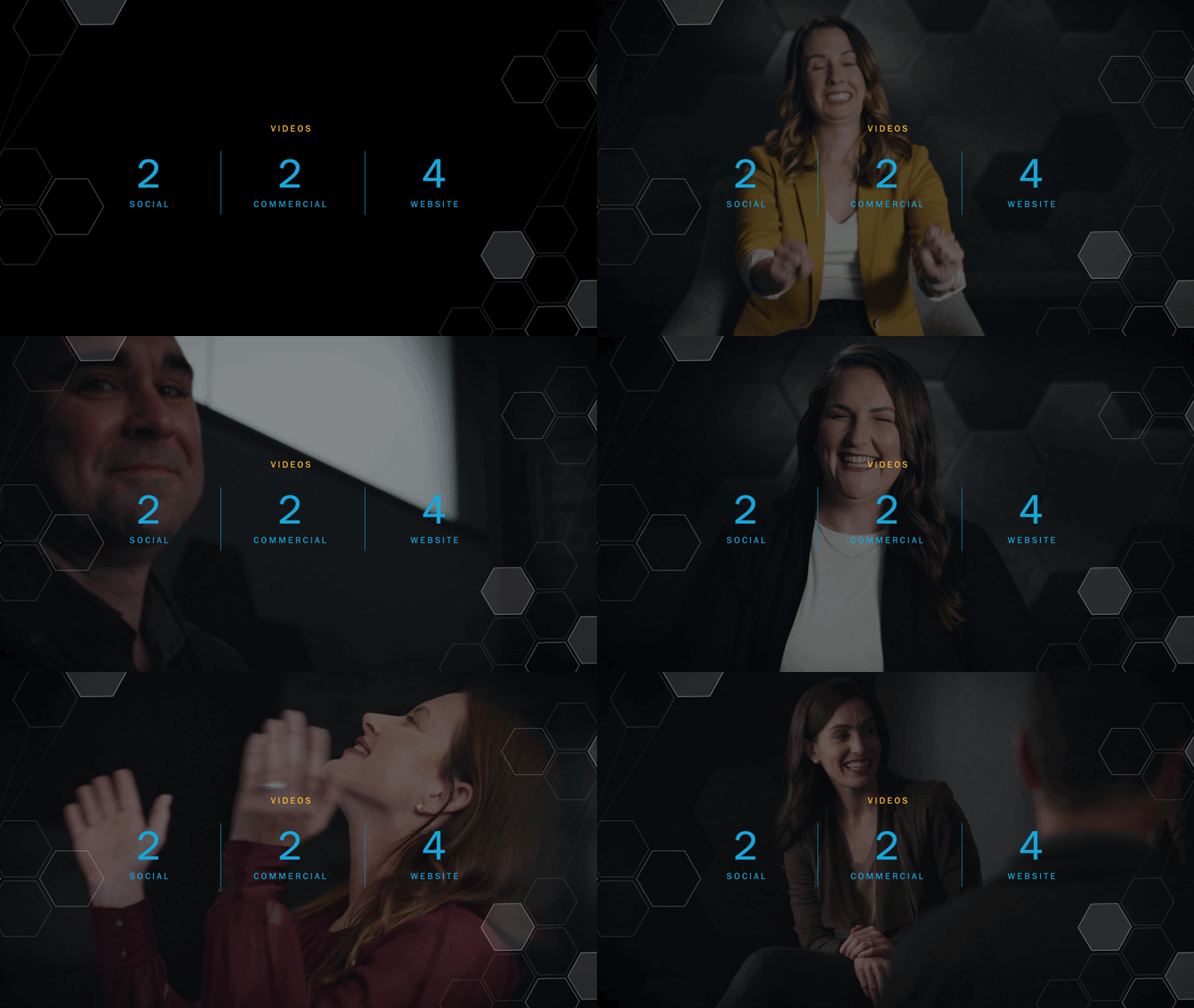
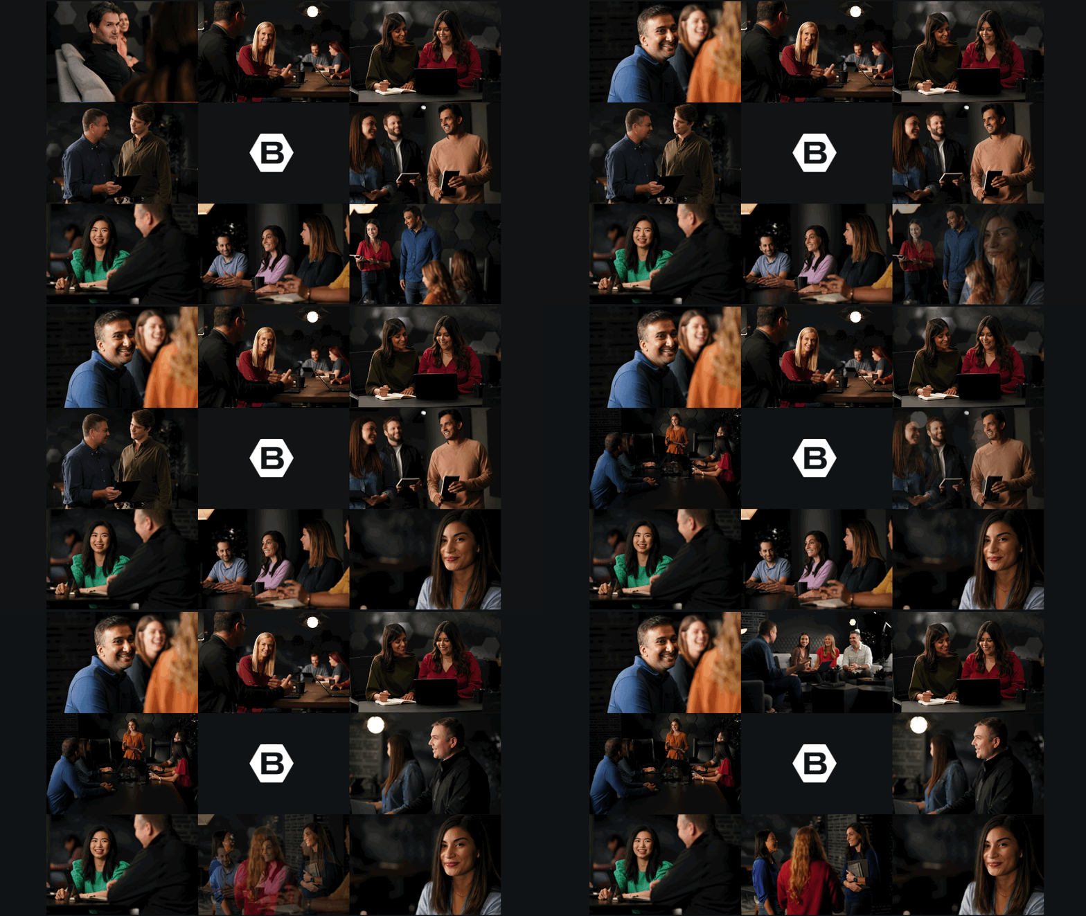
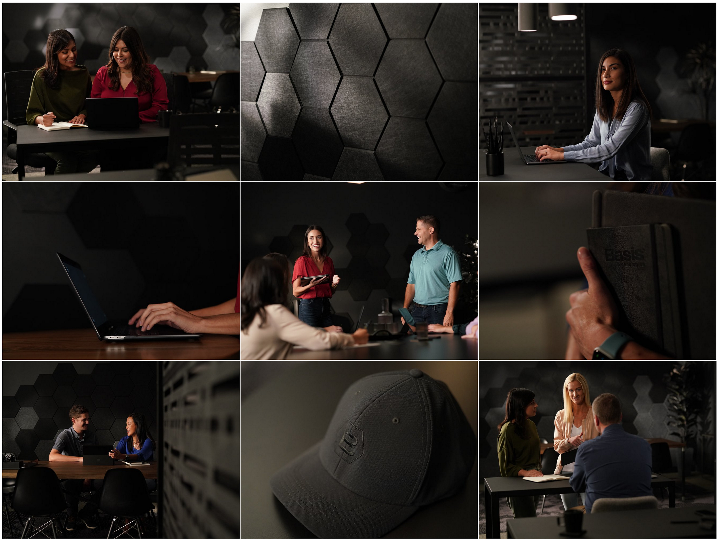
I orchestrated a comprehensive rebrand over two months, culminating in a four-day photo shoot and a one-day video production at our Chicago headquarters. We transformed our largest room into various office settings, employing a dark mode aesthetic that was meticulously planned and executed. This involved customizing props, selecting furniture, and adjusting lighting to ensure coherence with our new brand identity. I built out mood boards and look-books at multiple stages of development to communicate to multiple teams, had final approval on the environmental set selections, swag, etc. and choreographed choice scenes needed to for the final asset collection during the photo shoot. We achieved 1000+ custom photos, and an arsenal of videos: 2 social + 2 commercials + 4 website videos + hours of 4K and 6K footage of interviews + slow-motion b-roll. Each website video had a different goal and tone.
Custom Photography
Custom Videos
People First
For the rebrand, representing the people and culture were a priority. Below is a bonus item from the video shoot—not scripted or planned. We took extra footage of the CEO speaking off-the-cuff—the messaging was powerful—I requested a transcript to piece an extra video together and below is the result. The production company pulled all the warm, happy, silly visual moments that complimented the celebration of culture and this video landed on the culture page for the first year of the rebrand launch.
Launch Video
Launch video speaks for itself. Note—seeing it after the culture video shows the contrast in tone the videos reached for.
Tech Imagery
The challenge with the photo/video-shoot was that what was being developed was primarily for the services and company (culture/people) pages of the website (and a ton of collateral upgrades). While the planning for the shoot was taking place, I was also working with a team of UI talent building out 16 new technology pages to support the new tech-forward positioning. While the photo/video-shoot team had mood boards and stock videos to riff off of during planning and editing—they never had a glimpse of what those pages would look like until the official launch since they were built in unison. The challenge for me was to keep it all united and be sure that everything worked well together ’on-brand with the rebrand’. Below is a screen recording showing select stock videos chosen for the technology pages and a few samples of stock photography used in technology-focused collateral. Animation and motion were an important component to looking and feeling like a tech-forward company and can be found throughout the technology pages.
Dark Mode
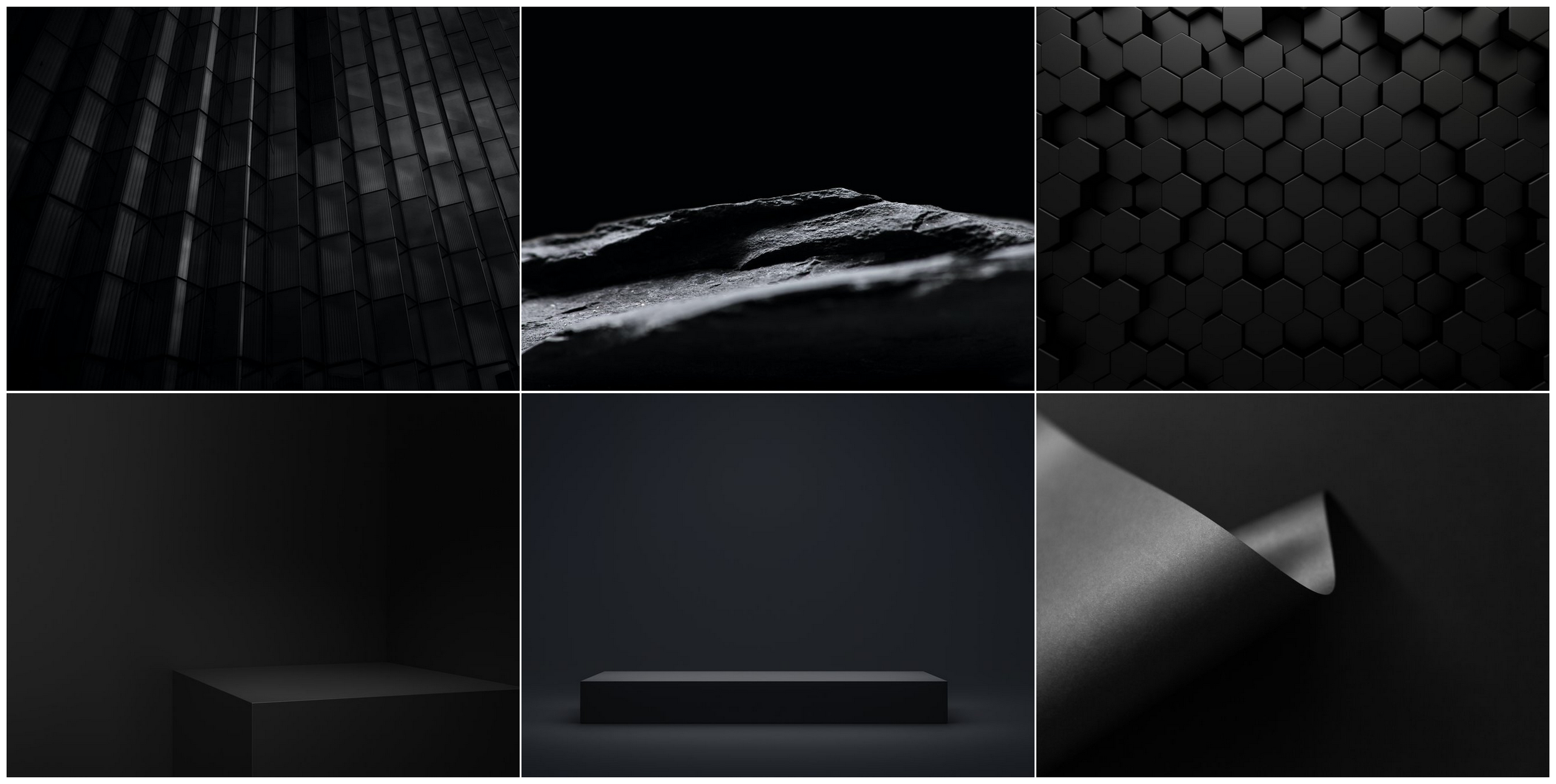
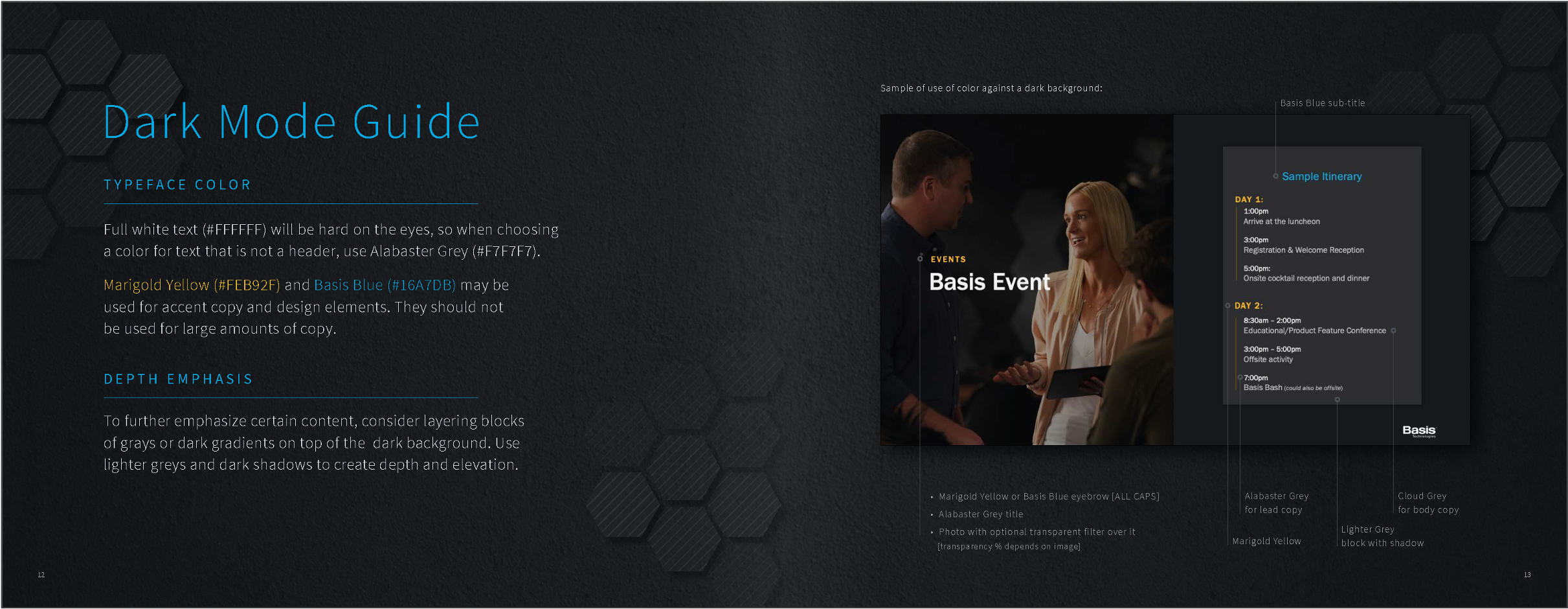
The choice to ‘go dark’ looks sleek and fun, however, the change was a design challenge for everyone that previously worked on the white-and-bright Centro brand. This rebrand forced me to relearn color and space with black and grays. Part of the direction I was able to communicate to a variety of talents/teams was due to a ‘dark mode guide & tip’ deck I built as a cheat sheet for myself. The guide was a study paired with visual samples of what works—and what didn’t work. Font and color have new rules with black—a few pages were dedicated to how to use variations of gray for font (what often looks white is not; white vibrates—variations of gray creates hierarchy on dark backgrounds). Some pages explored how color behaves differently when used with light vs dark backgrounds. Other pages were what I called ‘rebuilds’—I found dark mode visuals that I liked and rebuilt them so I could dissect the depth different grays provide when beside each other. The value of this document was priceless. So much so, that I had a dark mode section added to the company brand guide, shown below.
Language Matters
The messaging we committed to for the launch circled around the name change/rebrand being ‘a new era of [digital] advertising’—this was the north star for all paid media, social campaigns, and homepage language.
Innovate. Automate. Activate.
These three words were part of the rebrands momentum to own technology and automation in a new way.
Animated & Responsive Logos
One exciting part of the rebrand was the ability to work with an animator to customize a few iterations of an animated logo. At right is a morphing ‘B-Hex’ used as a broadcast bug for select videos and social.
The previous Centro logo never had a responsive logo. It was quite limited in how far one could reframe it. Peppering a hexagon and hexagon patterns throughout the new branding was purposeful—a reach for flexibility and responsiveness.
Credits
Production Company/Bottle Rocket Media [+team]
Photographer/Todd Rosenberg [+team]
Stylist/Amy DiTomasso [+team]
Web Developer/Eoghan Mc Inerney
Designers/Lilia Diaz + Megan Noone Ford + Melissa Munoz
Content/Kristin Furjanic [+team]
UI/Julie Bradley + Ryan Donida
Paid Media Partner/Gigasavvy
What is not shown >
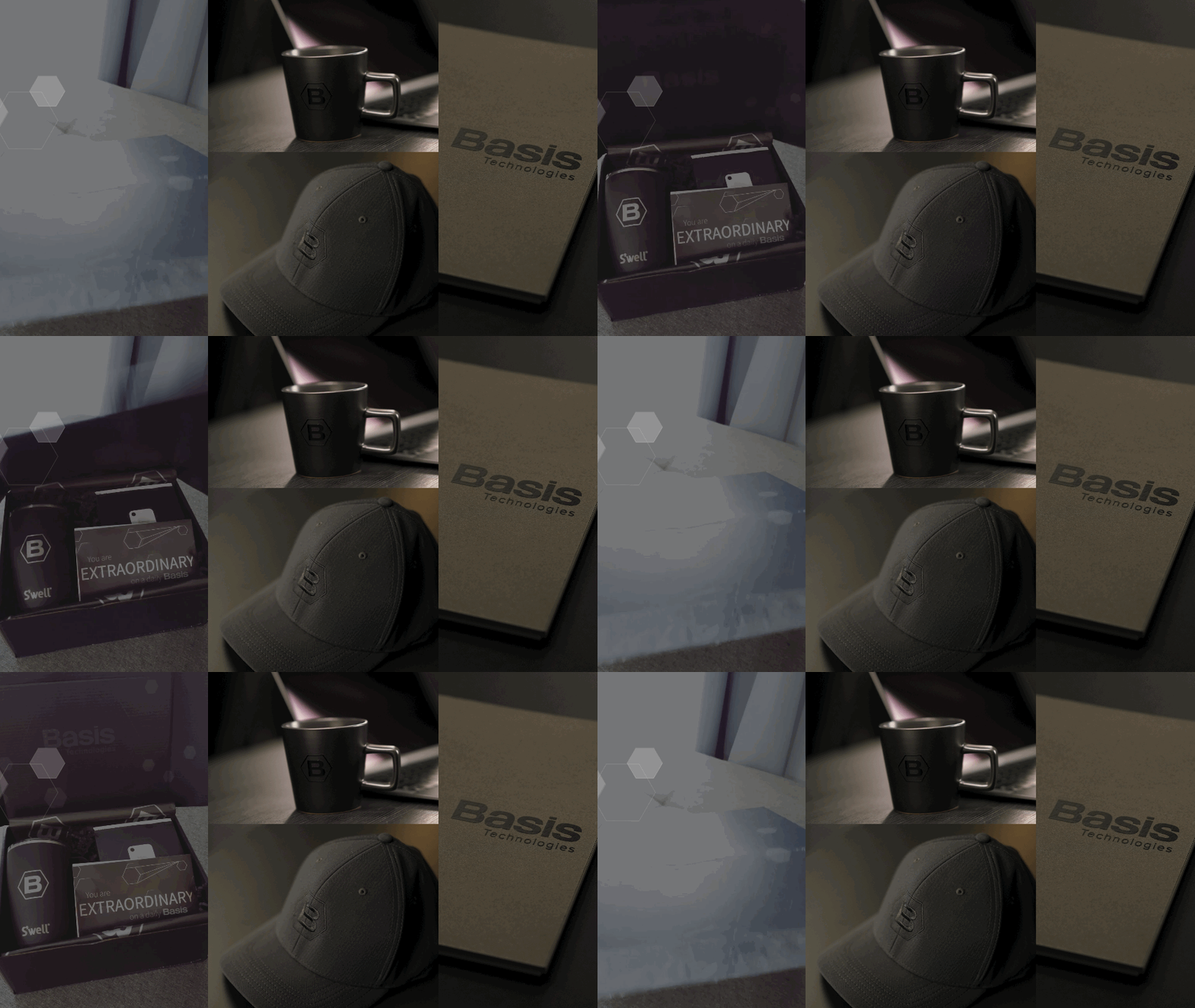
A rebrand this size required custom swag [for clients + employees], updated collateral [all sales + human resource material], new company templates [decks, emails, newsletters, etc], social media assets, a multi-paged brand guide and more—all of which are not shown above but can be shared upon request. Above is an overview of the website redesign—this may be shared as its own case study at a later date.
