Golden Campaign
Integrated Ad Campaign: Video + Digital + Print
ROLE: Senior Design Director
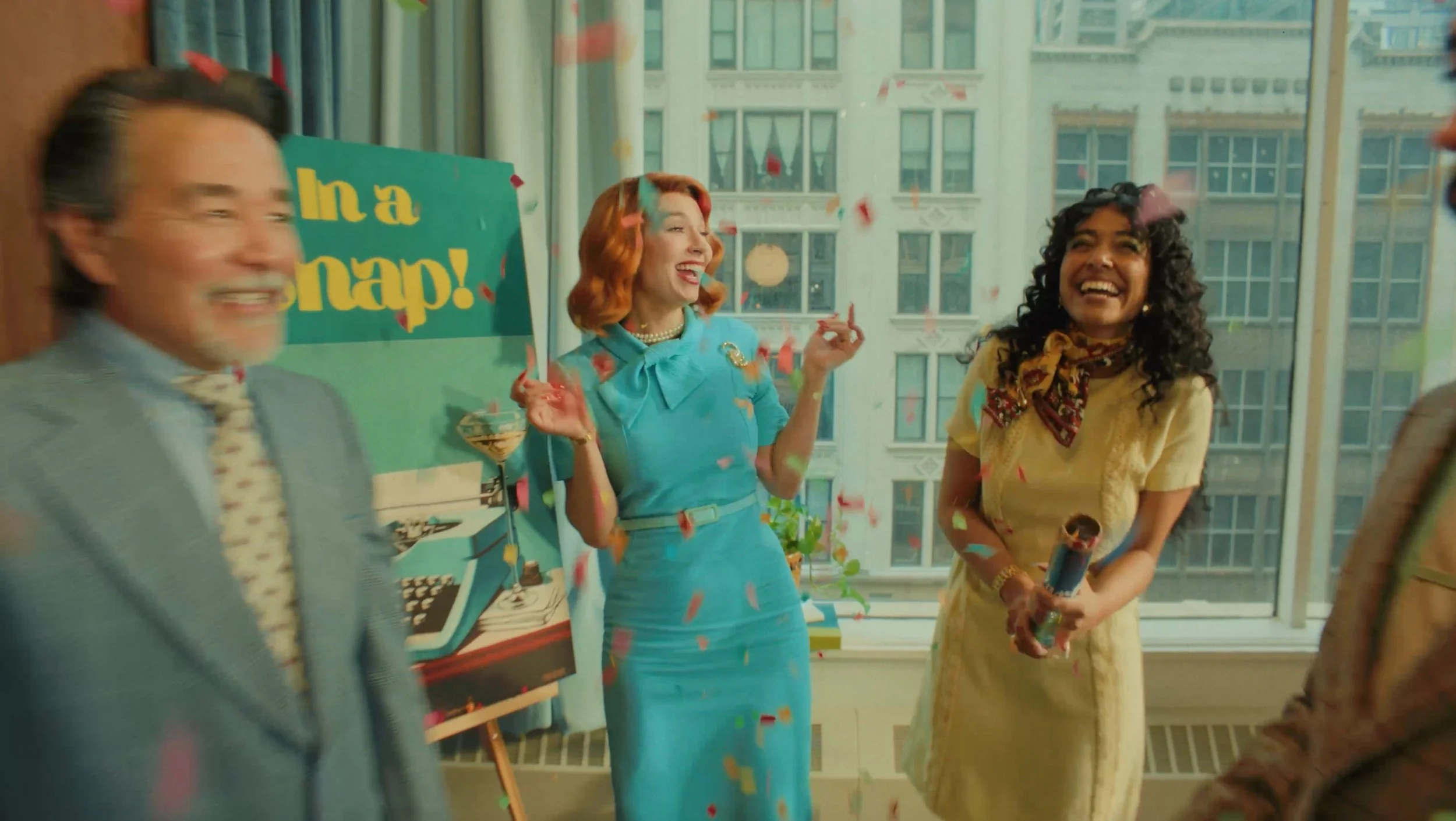
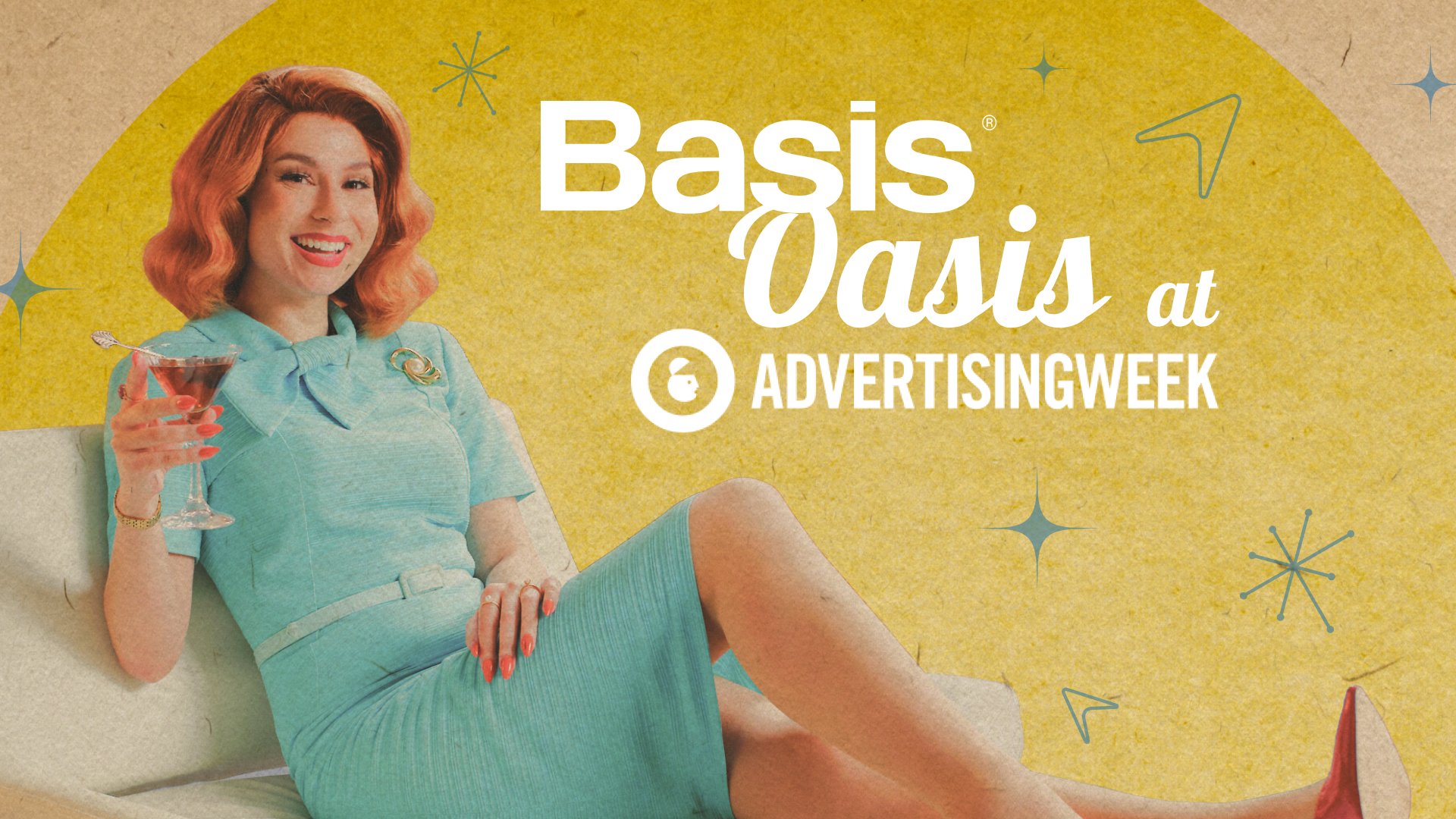
Basis’ Golden Age campaign, launched at Advertising Week New York, was a three-tier integrated approach to target their ideal customer profile across multiple platforms. With a sequence of custom commercials (:15, :30, and :60), targeted Always On HTML5 ads, and a memorable event space highlighted by strategic DOOH advertising, this campaign leveraged the momentum from previous major events to create a noteworthy and multifaceted experience.
The initial goal of the campaign was to highlight how Basis enhances advertising with automation, drawing inspiration from the glamorous and aspirational Golden Age of advertising. By positioning Basis as a partner that simplifies and improves agency work, the campaign mixed old-school charm with modern efficiency, showcasing a seamless blend of simplicity and today's technology. This layered strategy not only extended Basis’ reach but also strengthened the campaign's influence on brands and agencies. Indeed, we crafted something truly memorable for the adtech industry.
:60 commercial
The commercials were aimed at targeted audiences on CTV channels, YouTube, LinkedIn, 6sense Display and Video, industry trade outlets, digital out-of-home screens and more. The project involved intense planning and execution, covering a multi-day shoot for both video production and photography. This resulted in a library of assets for use across the campaign and a while after.
Advertising Week NY
“The Basis Oasis space [at AWNY] felt like an art exhibit.”
“I don’t know what your company does—but I know that I want to work with you…”
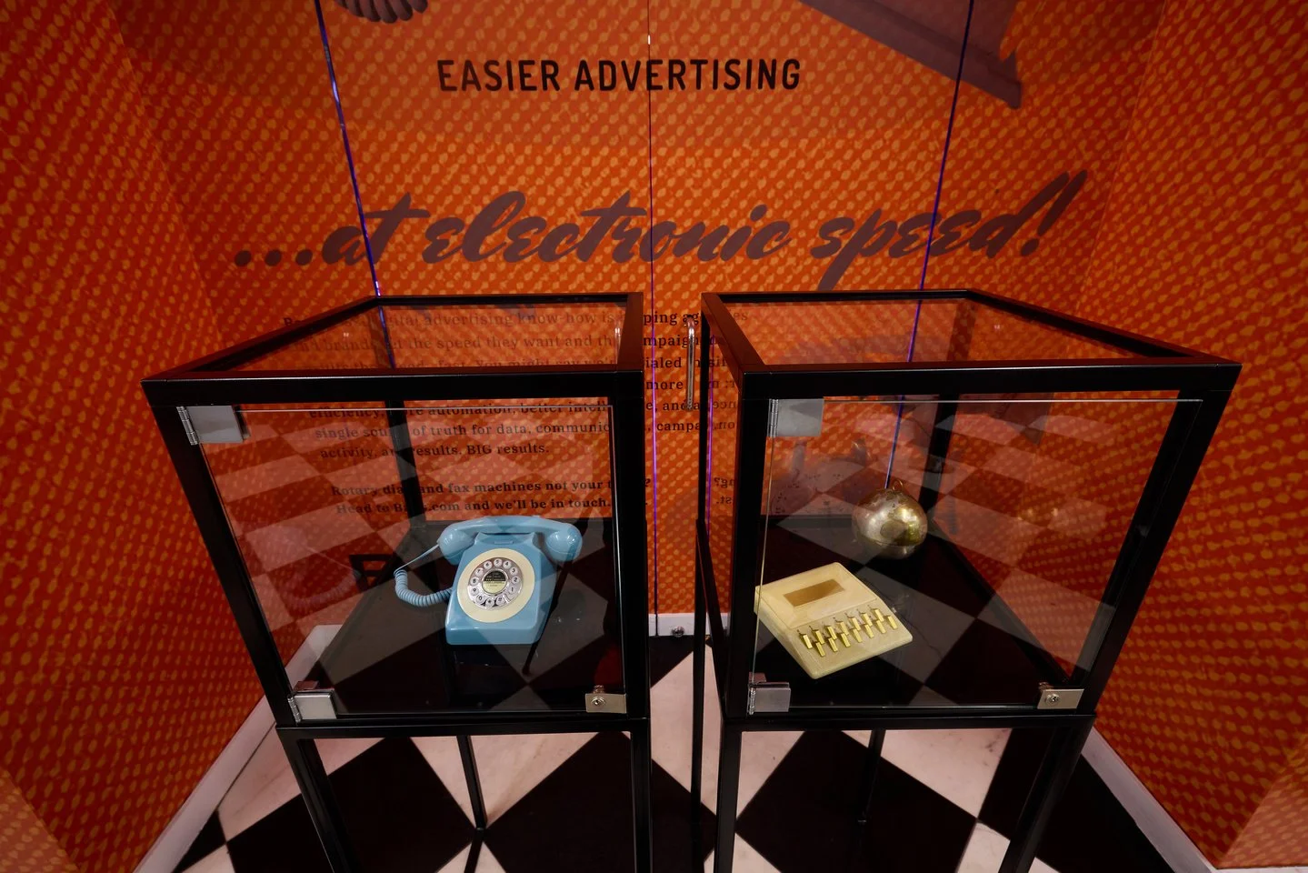
The Basis Oasis at Advertising Week NY (AWNY) was the result of a design-led collaboration between our design and events teams. This unique space, styled as a cozy 1960s retreat, featured a custom large-scale TV screen and was strategically placed across from our 'Instagram corner,' where guests could capture Polaroids in a vintage 1950-1960s office setting.
During the day, the Basis Oasis served as a relaxing lounge, offering coffee, beverages, and treats to keep guests returning. By evening, it transformed into the must-visit conference bar, complete with a signature cocktail that made it the hottest spot at the event. The arrangement of select props from our commercial along the walls and a New York-style poster wall behind our space added layers of visual intrigue and enhanced the vintage ambiance.
In a sea of predictable tech setups, the Basis Oasis stood out as anything but ordinary, drawing admiration and setting a new standard for creativity at AdWeek. This careful collaboration ensured that every detail—from the strategic location to the evening transformations—contributed to a fun and engaging environment, demonstrating that the little touches made a huge impact.
Vintage Posters
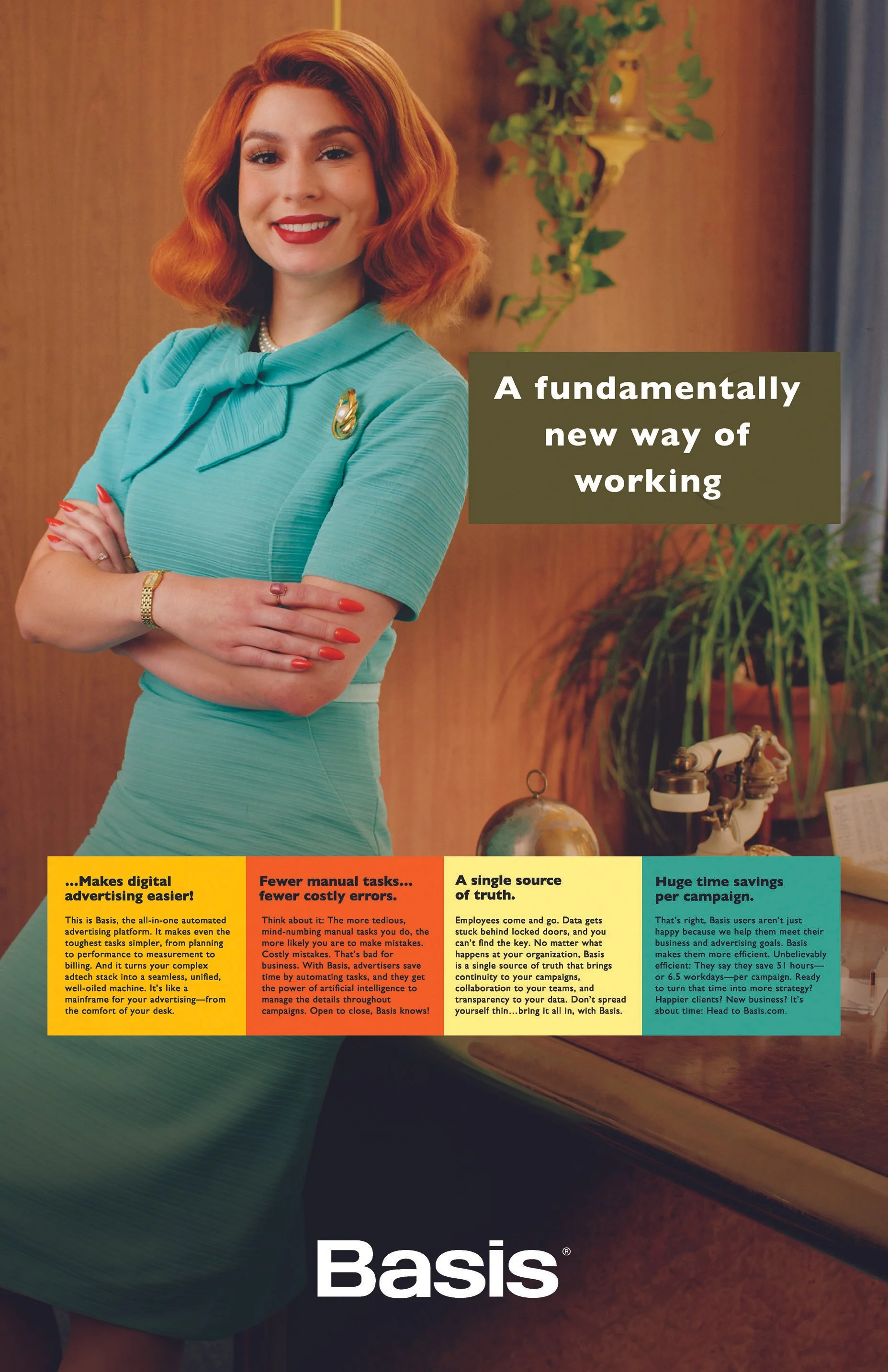
Initially envisioned as 'nice-to-have' elements for filling space in our initial concepts, these posters quickly evolved into a key visual focal point as we refined the overall experience. My design team skillfully selected vintage ads and reimagined them using imagery and props from our photoshoot, turning these posters into a true labor of love. Throughout the planning process, as we fine-tuned the floor plan and messaging for the event, I found myself asking for larger and larger versions of the posters to be applied throughout the space. This decision paid off spectacularly, as the posters became a major attraction, drawing guests and passersby alike for selfies and social media moments.
Always On Ads
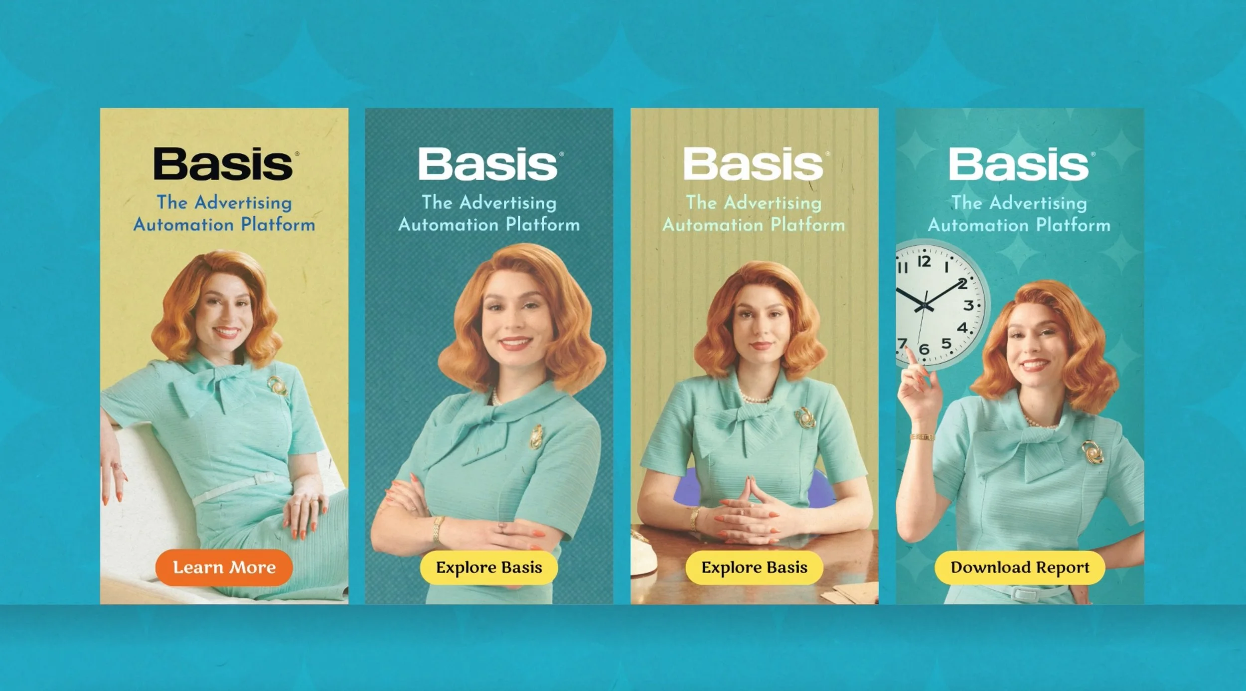
As Advertising Week started, we launched our Always On HTML5 ads alongside the commercials, creating a perfect trifecta of vintage bliss. After our photoshoot, I debated between using the original photography and giving it a vintage makeover. Opting for an illusion of era-focused authenticity, and after some trial and error, I decided that if we texturize the visuals to resemble vintage paper ads, we would achieve a delightfully paradoxical effect. Below, you can view four side-by-side ads to see the unique styling applied.
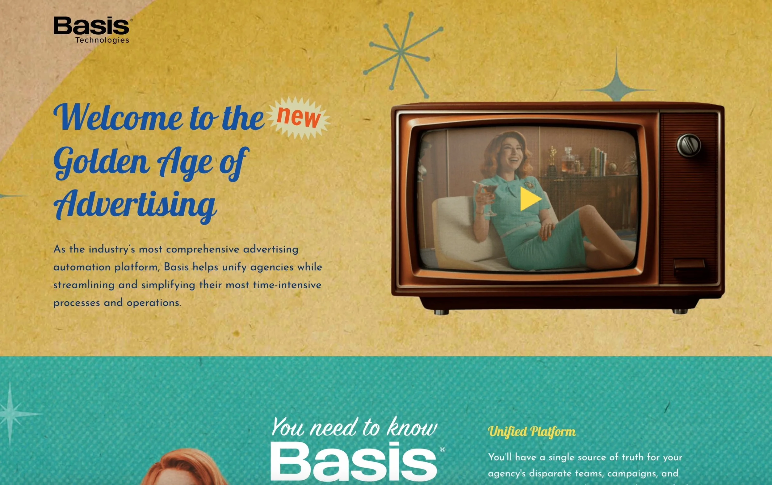
Every phase of the Always On campaign directed users to a custom landing page, like the one shown below.
We consistently applied the paper style across all landing pages for a cohesive look.
DOOH Ads
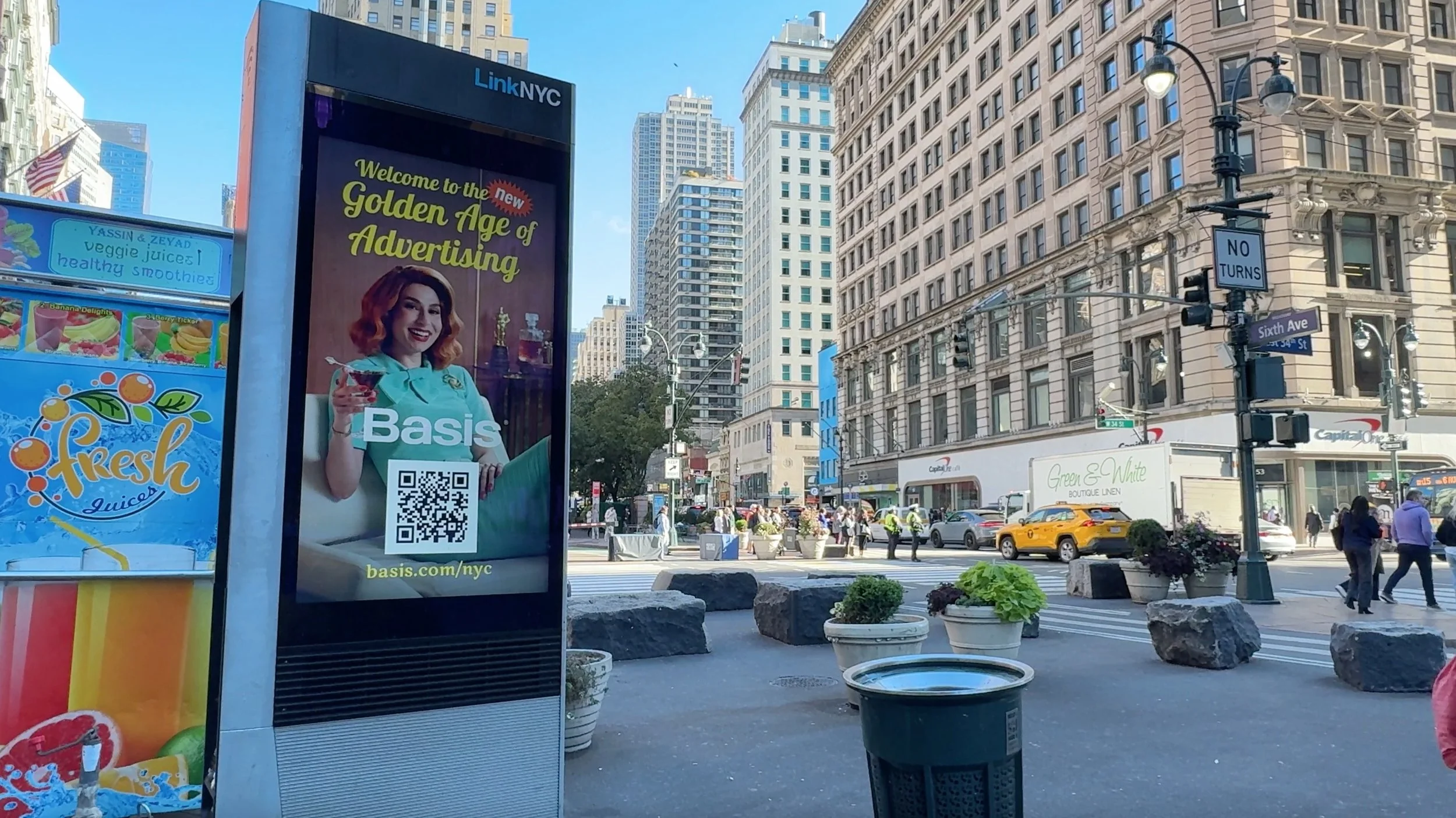
After locking in the aesthetic for the Always On ads, I realized we needed a visual bridge to seamlessly link the commercials and ads. The digital out-of-home (DOOH) ads were perfect for this. Below, you’ll see the DOOH ads we strategically placed across AWNY. Each ad blended slow-motion, non-audio video with vintage texturized patterns and typography. I opted for slow-motion video as a playful nod to New York’s fast-paced walkers, encouraging them to pause and engage with the slower footage. This smart mix of elements beautifully brought together both formats, creating just the right vibe.
What I loved about this project
Visual Strategy & Research
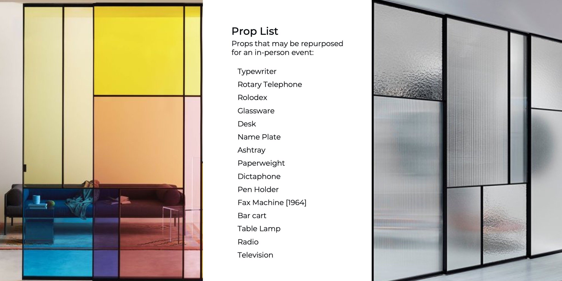
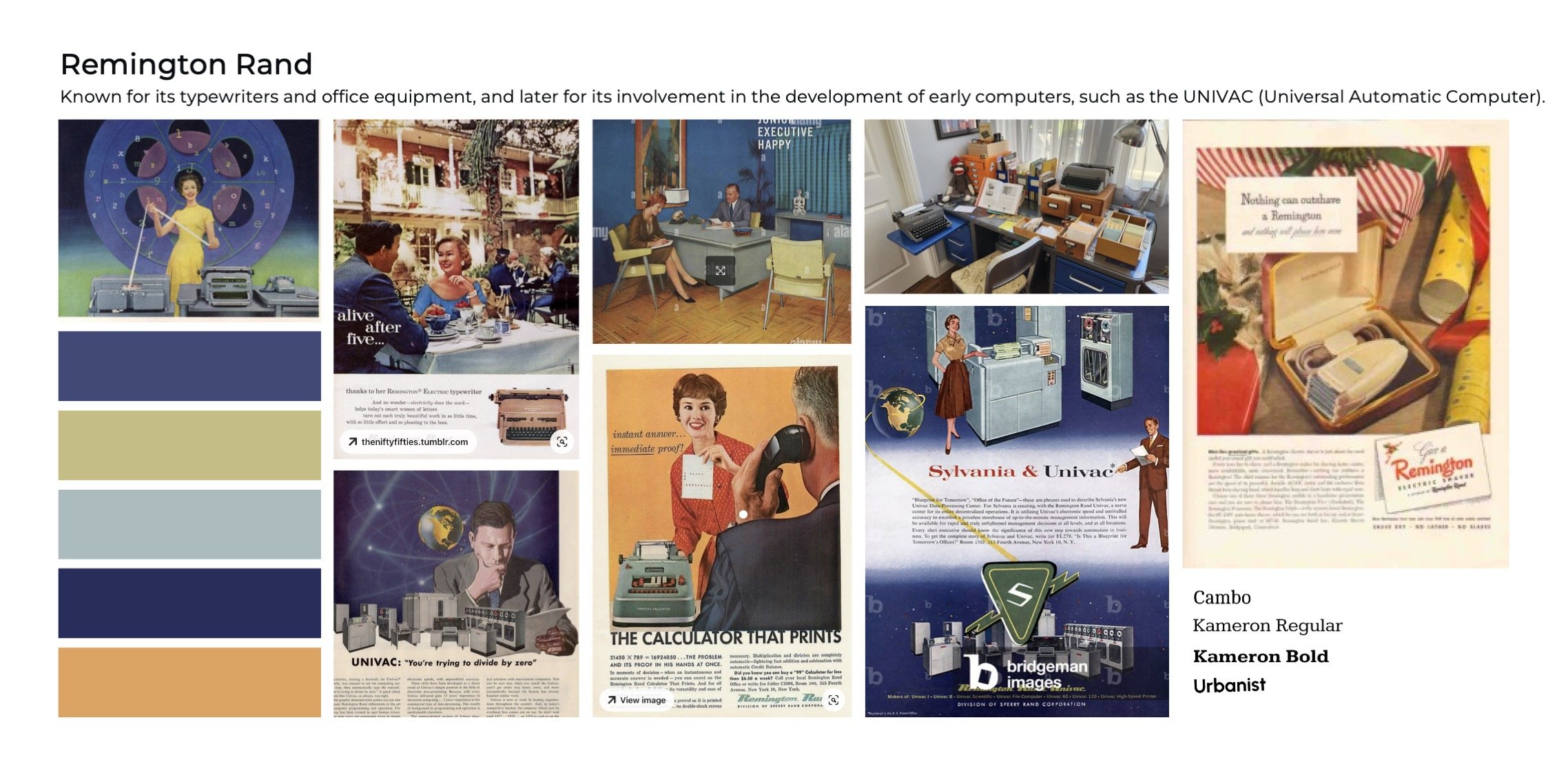
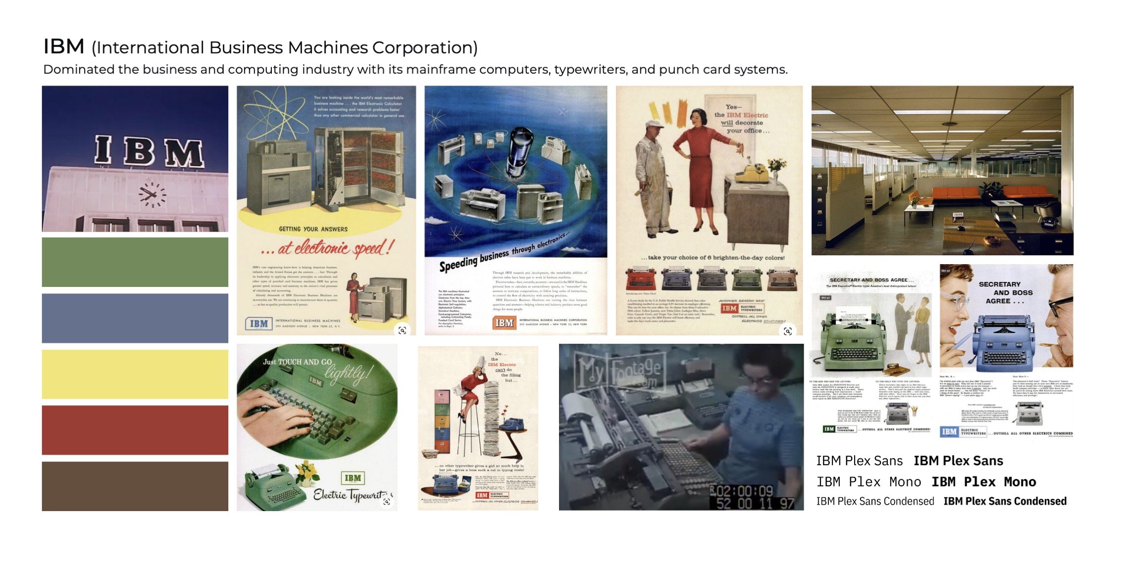
When we started this project, figuring out where to begin was challenging. We had rebranded a few years ago, and using a lead character or exploring the 50s and 60s for inspiration was new to us. However, solid research quickly turned into a clear plan. My goal was to develop a visual strategy booklet that would not only bring our character to life—showing her personality, office, and world—but also stay true to our brand’s core.
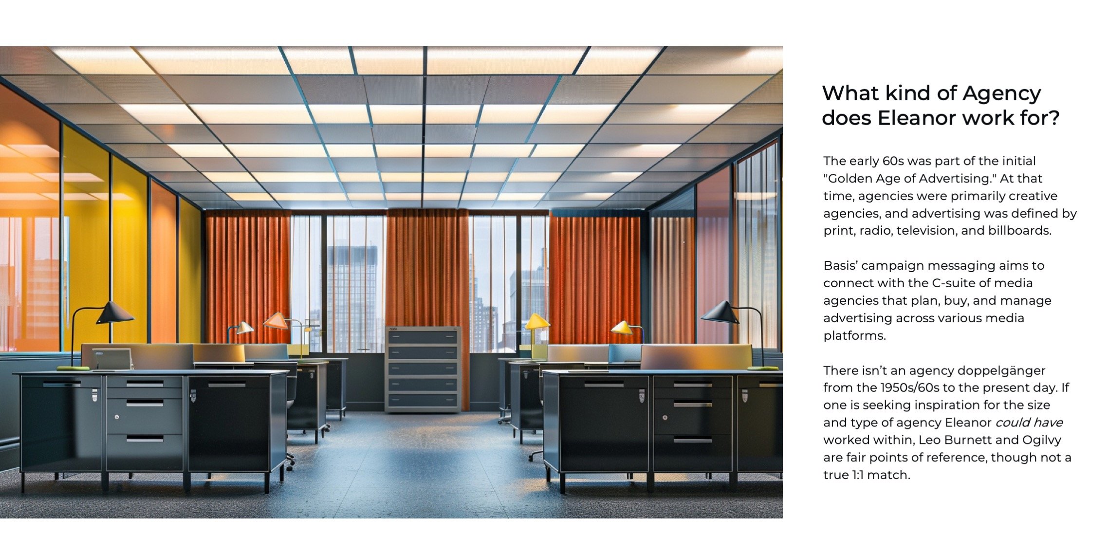
My design team focused on essentials like fashion, hairstyles, furniture, and office decor. We analyzed trends, colors, typography, and took cues from past eras' hotel lobbies and tech companies. Communication styles from vintage commercials were explored. Midjourney was used throughout from hairstyles to decor to environmental explorations. Getting internal alignment on how far out from our core brand we were ok with was very helpful when working through storyboards and being on set for the video shoot and the photoshoot. Below are key pages from the visual strategy we prepared before collaborating with BottleRocketMedia on photography and video. This planning allowed us to discover new creative directions for the brand and ensured our team moved forward in sync.






The Making of a Brand:
Original Photos vs. Vintage Backgrounds
Over the course of a demanding three-day shoot that combined video and still photography, we used the existing set as our primary backdrop. Due to our tight schedule, there wasn't much room to extensively plan the ads or create multiple design iterations. To navigate these constraints, I crafted a detailed shot list for the photographer that covered essential stills for the advertisements, event space, and detailed the slow-motion footage needed for Digital Out-of-Home (DOOH) ads. By leveraging stock photography and AI, we set clear visual targets that steered our production efforts effectively.
As the shoot unfolded, the set’s rich textures and nuanced lighting made the world come alive. The post-shoot phase brought its own challenges, particularly in deciding which images to display with the full background and which to enhance with vintage backdrops and paper textures. This editing stage is among the most challenging yet fulfilling aspects of my work, as it involves aligning the emerging brand guidelines with the final visuals, smoothing over any initial reservations.
Below are selected samples from the shoot, showcasing the outcomes of our meticulous planning and creative direction.
When finalizing the ads and visuals for Advertising Week New York, we naturally gravitated towards bold colors, patterns, and typography to balance the brown tones prevalent in our photos. It was serendipitous that we could repurpose these images for technology posters at AWNY.
Lasting Impact
AD INSIGHTS
$14.1 million From Sales Pipeline Influenced
3,000 Targeted Accounts Reached
8 Million Ad Impressions
4,600 Total Users Visited AWNY Landing Page
EVENT INSIGHTS
3,600 Basis Oasis Visits over 4 days
1,700 Unique Contacts Earned
2,500 Martini’s Served
Credits
// A project like this is a true collaboration //
This project was a true relay race of talent and trust.
Below is a list of all the team members who contributed.
Huge props to my internal team and to BottleRocketMedia—
they made all the pieces come together in a very short amount of time.
Applause, applause to all listed below!
IN-HOUSE TEAM
CMO: Katie McAdams
SVP of Brand: Ryan Manchee
EVENTS
Taylor Vick: Field Marketing & Events Manager
Annie Katz: Sr. Marketing Operations Manager
DESIGN
Jenn Rachwalski: Sr. Design Director, Brand
Lilia Diaz: Sr. Brand Designer
Kelly (Ward) Diehl: Brand Designer
Troy Gould: Multimedia Designer
CONTENT
Ben Larrison: Sr. Director, Brand & Content Marketing
Eric Nelson: Content Marketing Manager
Mindy Zhang: Social Media Marketing Specialist
CAMPAIGN STRATEGY
Jeff Mathews: VP of Growth
Megan Balbach: Integrated Marketing Manager
Annie (Wold) Bolles: Integrated Marketing Manager
Nick Clark: Marketing Automation Director
Jim Bouschor: Web Developer
OUT-OF-HOUSE TEAM
PRODUCTION
Bottle Rocket Media
Principal, Executive Producer: Brett Singer
Executive Producer: Mark Cwiakala
Director: Jessica Batson
Talent: Clare Czechowicz
DP / Photographer: Joe Martinez Jr.
Gaffer: Gadi Solis
Production Designer: Maegan Batson
Wardrobe: Taylor Zielinski
Hair: Igor Shashkin
Makeup: Erica Martens
Color: Assembly with Maria Carretero and Katie Andrews
ADDITIONAL CREW
Extras: Taylor Jones, Al Herrman, Gabriela Barrios, Blake Hood, Nico Fernandez
1st AD: Saró Melero Bonnin
2nd AD: Claire Daffada
1st AC: Andrea Baker
DIT: Jack Lawrence
Key Grip: Geoffrey Fingerhut
Dolly Grip: Kyle Ruckert
Swing: Emmanuel Terrell
Art Director: Kyle Dodge
Set Decorator: Jordan Blase
Art Assist: Kaden Maloney
Wardrobe Stylist: Taylor Zielinski
Sound: Tyler Lang
PAs: Matteus Rabel, Deen Rosenberg, Drew Hartley
POST-PRODUCTION
Color: Assembly TV
Colorist: Maria Carretero
Color Producer: Katie Andrews
Editor: Zak
Camera Gear: Daufench Camera
G&E: Atlas Lighting
Casting: Trigger Studios
